Friday, March 30, 2007

TAKING AIM AT ONE OF POD'S BIG PROBLEM AREAS

As we attempt to push the poor P.O.D. authors and small presses to raise their standards, it becomes necessary to deal pointedly with an issue that has plagued many a recently reviewed book here at PODLINGS...
Ugly, unprofessional covers can do more for killing the scraps of attention your book might get in an online market than just about anything else.
Why? Because it is the first and potentially last thing people will see of your book. Do you think you can't judge a book by its cover? Consumers do it everyday and all to often that judgment is accurate. So, we'd like to site some examples along with comments about what makes them good or bad to give you, the self publishing author or small press owner, some food for thought when obtaining your next book cover design--you know...when you get around to fiddling with the photoshop software you bought to produce your own modern art masterpiece, despite the fact you haven't even read the instruction manual.
Below are some small press to self published covers along with their strengths and/or weaknesses...are you taking notes?

This cover from Velluminous Press in the U.K. may appear simple, but notice that there is actually quite a bit of detail. The background is sort of like an old worn parchment and that big detailed eye, with lids formed from the background material, instantly captures your attention. These elements combined with the odd title, give you no idea about the story within, but you just can't help but be curious about it.


This cover from Breakneck Books Publishing has alot going on: A forboding castle set with appropriate shadowing when compared to the dusky sky above, an armored hand weilding a vortex of power, and the dark knight on the back. Notice how the cover text is all positioned correctly and the different text styles all compliment one another. Everything says, "Professional." If you're thinking, yeah they paid big bucks for that cover. You'll be surprised to know that the owner of Breakneck designed these covers personally, albeit not without some artistic background.


Now, see if you can spot the small press from the self published efforts!!


If you were paying attention, then you should have noticed a great deal more depth and character to those self published or small press covers which have put forth considerable effort to accomplish one goal: "Become indistinguishable from books on bookstore shelves!" This is but one of the few key hurdles you face as POD authors to being taken more seriously by the mainstream publishing industry.


Thursday, March 29, 2007

NEW POD AUTHOR INTERVIEW PAGE!


Not to be outdone within the industry...we at PODLINGS have just opened up a brand new "dedicated" POD author interview page.
We couldn't get "The" Larry King to do our interviews, but we've got the next best thing!
There's a link on the sidebar or just click HERE.

P.O.D. JUST WANTS TO BE LOVED


Let me give you a situation:

You are the poor author who has submitted his master sci-fi fantasy work: "Attack of the Bodacious Bikini Babes from Planet Playtex," (it's going to be a trilogy, don' t you know), to every publisher willing to accept unsolicited manuscripts (yes, all four of them). Your valiant efforts have garnered a cold, wet place on the bottom of a "slush pile" but little more. So, you decide to go with a small press, even a micropress, and meet with the same disinterest in your work. Ah, but you could self publish the book yourself! Yes, that is undoubtedly the answer...A quick web-surf through "shark" infested waters finds you a slick subsidy publisher ready to take your money or maybe you just do it over at LULU.COM for free + the $150 to get distribution to Amazon.

Now, your masterpiece is ready (word used extremely loosely) and sent out into the marketplace. You set up a free website on a well-worn uninteresting template, find a few bloggers willing to review the book and sit back in your easy chair to refresh your amazon ranking page every five minutes and wait for the money and fans to roll in.... A nice fantasy (more reality than we'd like to admit).

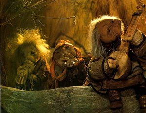
The truth of the matter folks, if you take a gander at the featured photo, is that we find ourselves in rather a "LURCH" in the publishing industry. We put on our best suit and tie and look to the publishing industry with a longing to be accepted and loved. But the industry sees, time and time again, a freakish, monstrosity of bad, poorly edited writing, very distasteful, unprofessional book covers and sloppy interior design. We POD review bloggers like myself, PODCRITIC and others are willing to wade through the morasse sent our way hoping to find the precious few gems among many lumps of coal. And with the purpose of pushing POD authors and presses to step up to the plate and put forth the best possible writing and book production they can.

Take a look at that picture again, folks. This is how the industry you want to be a part of perceives you and your books. Only you can change that perception, but it will take a serious concerted effort on the part of authors and small presses alike to do it. As my friend PODCRITIC has stated, "this is your industry and it's up to you to build it up." The large trade publishers have no incentive to help you...if you want them to take notice, then give them something worth the effort.

Wednesday, March 28, 2007

QUEEN KLUTZ by MARTI LAWRENCE


Queen Klutz by Marti Lawrence is a lulu.com title surveying the many unfortunate instances in Mrs. Lawrence's life (it's amazing she has survived) and her humorous take on them.

This book is taken from the perspective of a mother and most of the "series of unfortunate events" occur around her home and to her person...as she tells us she is "a very clumsy woman."

Unfortunately, there are several clumsy aspects to the writing and production of the book as well. While this collection of personal anecdotes has humorous potential, particularly if you find yourself in similar situations, the delivery is lacking somewhat:
  • Mrs. Lawrence has a peculiar penchant for laying down the narrative in the same blocky style you might find for directions on a cake box: Example: "She contacts husband, checks on family members, performs dozens of other helpful tasks, assures me things will be fine, gets me a glass of water, finds cure for cancer. (not really, but she is certainly diligent enough to.)--Now at first I thought, this is just a humorous little thing for this story--it works when used very sparingly. However, Mrs. Lawrence repeats this same recipe for disasterous prose throughout the book in nearly every story again and again. It gets old very quickly folks.
  • The interior design of the book is very choppy water: exaggerated spaces between paragraphs and sentences--maybe I've just not read enough Lewis Grizzard?
  • The cover for this book is very badly done--a personal characature of the author, done badly. It just screams in agony: UNPROFESSIONAL!! I hate to keep beating the proverbial dead horse on book covers folks, but this is a very key issue with online markets, not to physical bookstores. People rarely go past a terrible cover to investigate the content.

If you are a housewife or working soccer-mom you might find some gems to amuse in this collection, but you'll have to be very forgiving on the writing and format to enjoy them.

Monday, March 26, 2007

*SUBMISSION GUIDELINE CHANGES*


In the interest of trying to help the poor starving authors out there...I should know; I am one...we at PODLINGS have changed our submission guidelines in order to allow novel submissions by PDF file rather than having to send a physical copy to us.
Please be aware that we need a PDF since we intend to review POD novels based not only on the narrative, but also on book design. We will also need a decent sized cover file to accompany your PDF file--both as attachments--in addition to any weblinks you would like the book review to include.
We hope this will be a help to you the authors.
PODLINGS

Wednesday, March 21, 2007

WARRIOR GIRL by JANICE WEE TIEN YONG


Warrior Girl by Janice Wee Tien Yong is a three part series self published through lulu.com. The books are only about 100 pages each and with only three, one might expect the author could just have made one novel length book out of them.
Inevitably, I'm going to end up sounding like Simon Cowell during the first round of American Idol auditions when reviewing this book series. I can only say that reading Warrior Girl and the counterparts, Lost in Another Realm and The Dark Warriors reminded me of the feeling I had when watching "The Rocky Horror Picture Show" for the first time, complete with a theatre full of carefully cued hecklers...What in the world is this?!

  • First, the books are action packed, however the action has no discernable point to it. In fact I found no good explanation of where it was happening or why. Starting the series was like being dropped into the middle of an H.P. Lovecraft-esque acid trip...protagonist chased by endless baddies and everywhere she stops for a rest, a bat or spider or centipede morphs into some ghoulish human mutant to continue the chase, but I still never got what the point was supposed to be. Action for the sake of blind action doesn't make for gripping writing, folks.
  • Secondly, the books are full of descriptive prose. In fact every little action is overly described or compared and in sometimes very weird ways...Example: "With the suddenness of acid reflux, lightning flashed across the heavens. The sky groaned with thunder. With impeccable timing, the clouds vomited like a child with stomach flu." Hmmm...uhm, okay...
  • The front cover art isn't too bad and somebody obviously went to some work on them, but the interior of the books is way out of whack...normally the text is single spaced with more space between POV changes. These books have double spaces between nearly every sentence. Now when you get into book form this looks very strange, with half of the page space ending up empty.
  • The "Love Story" aspect of this is forced at best...Example: "This gorgeous hunk saved her life. He exuded raw charisma. her cheeks reddened as he spoke, though she tried to hide her reaction from him. He talked animatedly about a world so different from the one she knew. I'm in love. Her heart frolicked as she gazed at him." --yep, it must be love...she just found out his name at this point. There's also several annoying references to this character as "The Flying Hunk," before we eventually get his name...do people still say, "Hunk?"

Now, honestly I don't like to seem so cynical about a book or series, but I just can't seem to find a way around it with Warrior Girl. The books read like tributes to every bad "B" movie you've ever seen. And while Dr. Frankenfurter and his Rocky Horror Show cronies have gone on to be underground hits with everyone who enjoys heckling a badly made, silly movie...the sad truth is that authors won't be received that way with such work.

Tuesday, March 20, 2007

DRISTLEMORE by BRIAN MONIZ


Dristlemore by Brian Moniz is a traditionally styled fantasy which takes the reader on a quest within the magical realm of Gandril.
The narrative revolves around a young man named Cain who escapes a sudden raid on his village of Geddington by the forces of the Twilight Union as lord Saer Mydoc searches high and low for an enormously powerful sorcerer named Dristlemore. Cain and his surviving companions must then set out on a quest for answers with little more than the name "Dristlemore" and a cryptic letter from a secret magical society called "The Selected."
In Dristlemore we have your basic fantasy setting and the archetypal "Bad Wizard / Good Wizard" style of quest and drama. The story has the potential to be very engaging if executed properly. However, the reality is that Dristlemore is plagued by several key problems which continually disengage the reader from the story.
1.) The writing in Dristlemore doesn't lack for discriptive prose, but it does lack the sort of engaging tension in the prose necessary to propel the reader forward through the story. Dristlemore tends to sputter along more like an engine out of time, never gaining the momentum one would hope for.
2.) A recurrent problem throughout Dristlemore is Mr. Moniz's tendency to reiterate the exact same thought several times within one paragraph in consecutive sentences.
:Example: "Cain looked up at Garret. He had totally forgotten Lee knew something about The Selected! With all that was going through his mind and the amount of traveling they had all done today, he had forgotten. He was unsure how he could have, but he did."
:Example: "The farfetched thought of his mother learning magic entered his mind, but he quickly dismissed it. It was the only logical explanation he could think of, but he highly doubted it was true. He didn't think it possible his mother could use magic."
Now we can easily see that the first sentence covers the thought, but it's as though the writer is trying to decide which way best to say it and instead just writes every way he could state it. This sort of thing is ongoing throughout the book and comes across like hitting a speed bump at 60 mph.
3.) The dialogue also lacks the interest and conviction hoped for and seems more stilted than anything.
Now, these are problems we all might expect from a first time novelist like Mr. Moniz, however (and this is where the whole subsidy publisher "getting what you pay for" argument comes in), you would expect that Iuniverse would have provided enough editing to catch these problems and help the paying author fix them before going to press. What we tend to find in the whole subsidy publisher realm is that rather than genuinely trying to put together a marketable book, the subsidy like Iuniverse is more interested in catering to author opinion and producing a book they already anticipate is going to sell more copies to the author than anyone else.
Once again, I have to point out that the cover, which was designed by Mr. Moniz, lacks that professional quality you would expect (his name is even off center on the cover of the actual book) and this is a key factor when selling to online customers in particular. One might think, given that Iuniverse didn't do any cover design, that the money paid could have gotten some better editing to fix the aforementioned problems. On a slightly positive note, the interior does have some nice maps, but it is unlikely nice maps are going to save the project with so many other problems left in place. I don't ever desire to "bash" the writer, but rather provide some constructive criticism so that authors, especially self published authors, can step up to the plate and give themselves the best opportunity for success with their work.

Monday, March 19, 2007

CONSTANT READER by JENNIFER REEVE


Constant Reader by Jennifer Reeve is short story / novella in which we find an aspiring novelist who's dreams of literary success have just come to her big time, but something else came along for the ride!
Constant reader is an ode to Stephen King in parody form where the protagonist, a female novelist, has struck gold with her latest literary effort and along with the riches and fame that come with her new success comes a deadline which must be met for her next work. Our would be heroine finds herself with a bit of writers block as she enjoys all she has ever dreamed of and more, but then she begins to be haunted by what can only be described as the demon muse of the legendary Stephen King himself.
There's some good writing here, but in all honesty, if you're not a Stephen King fan, then you probably won't find much that holds your attention for very long...I'm not a Constant Reader of Mr. King's work personally and so many of the references, which to fans would seem witty, were lost on me. I assumed they were clever because I understood the premise, but otherwise...no, sorry.
In all fairness, a short parody is all the book is attempting to be and as I stated before, "If you're a fan, this may give you a chuckle or two."
I will note that the language was a bit heavy in some places, but that's my personal tastes. On the book itself...this is a self published lulu.com title at 104 pages. The book could do with better interior and exterior design, particularly the cover, which says nothing to me about the content. I'm a stickler for a good cover, particularly because if you are selling to an online market then this is the first and perhaps last anyone will see of your book. If the cover is really engaging, then most may take a closer look. The editing was pretty good, but spacing between paragraphs was exaggerated. But if you're a Stephen King fan and a Constant Reader of his work then plant your tongue firmly in your cheek and give this one a try...at the very least, it's a cheap download.

Thursday, March 15, 2007

BEN AMITTAI by Bruce Judisch is a Christian novella in the historical fiction realm. The book is based upon the early years of the Prophet Jonah and addresses his calling from God and his journey to carry God's message to King Jeroboam II.
The book is a short read at 138 pages, but is engaging, especially if you enjoy historical fiction centered around biblical events. Mr. Judisch is an excellent writer and his prose is very fluid. I personally wouldn't be surprised to find that Mr. Judisch has written other works even if they remain unpublished.
The story isn't quite a thriller but there is some action and quite a bit of character development to people like Jonah we hear little about, other than the biblical account of his brief incarceration inside the belly of a whale.
The book itself is very well done; produced by Tate Publishing which is a Christian based subsidy publisher. I have to say though, given what I've seen from subsidy presses like IUniverse and others, this book design is top notch...of course Mr. Judisch has footed the bill for it, but a nice product is a nice product. And personally, I think as an author you should get what you're paying for.
Also of interest is the fact that Mr. Judisch is donating the majority of proceeds from the book to the support of missionary efforts; claiming to keep only that necessary to cover his personal costs for the book itself....bravo!

Tuesday, March 13, 2007

POD-DY MOUTH SHUTTING DOWN FOR GOOD?


Dear Pod-ders,
It appears that girl-on-demand has decided to shut down the very popular POD-DY MOUTH blog. This will no doubt come as a blow to pod-ders who hoped to some day be featured on the blog. Perhaps the most interesting thing about this is that the mystery of her identity will remain a mystery. To girl on demand--"we'll miss you; be well!"--PODLINGS

Thursday, March 08, 2007

DOUBLE VISION by RANDALL INGERMANSON


Double Vision by Randall Ingermanson is a hybrid sci-fi, thriller, romance novel that never seems to decide which genre it really wants to be.
Now, crossing genres is nothing new and there's certainly nothing wrong with it. But I was actually expecting more of what the cover promises -- suspense and intrigue.
As it turns out though, there was some suspense, a bit of intrigue and a clean cut Christian love triangle centering around an autistic "mozart" styled quantum physics prodigy named Dillon.
Double Vision has enough premise to be any of several kinds of novel and do well. My hope was that it would run more with the quantum computer disaster possibilities and the thriller elements that could have gone much farther than they ever did, but that's simply because of my personal tastes. The novel does a nice job of providing an interesting story, with good writing and the romance elements are always battling with the quantum computer scandal for prominence. I have to say that were I to take up romance novels on a regular basis, Double Vision would be the sort I would gravitate toward with its sci-fi elements. And since Ingermanson is himself a physicist, he has no trouble presenting quantum mechanics in a way that even us know-nothings can handle. While I can't escape the idea that this premise could have been handled in a much edgier fashion and made for far more excitement, Double Vision does deliver for a christian romance with a bit of intrigue and a lot of heart.

Tuesday, March 06, 2007

THE FINAL STORM by WAYNE THOMAS BATSON


The Final Storm by Wayne Thomas Batson, is the thrilling final chapter in The Door Within trilogy. I've reviewed the other two books in this trilogy and haven't been disappointed yet. The final installment is no less thrilling, in fact, I think Mr. Batson manages to ramp up the action even more for a wonderful climax to the story.
This series has followed a classic dramatic pattern. As George Lucas has said of his original trilogy, "It's a three act play: in the first act you introduce the characters and the situation, in the second you get them in the worse trouble they can possibly be in, and in the last act you get them out of it."
The Door Within follows this pattern and does so with great success. In the first book we find out about the scrolls of Alleble and The Realm of Glimpse kind; a sort of parallel universe with our own in which every person has a Glimpse twin. However, in the Glimpse universe, we have a fantasy realm with dragons, knights, archers, and other mythically styled beasties to whett our appetites. In the second book, The Rise of the Wyrm Lord, the main characters are switched a bit and we follow another character into the realm and find the worst case scenario for the Realm coming to pass with the rise of ancient creatures wielding tremendous power and death dealing capability. (And here I think is one of the places where I think this series has successfully parted ways with the likes of Narnia...there are some really bad beasties here and they are very prominent!)
In this third act of Mr. Batson's dramatic play, we find hope again with the coming of The Three Witnesses. We get to see our hero from book 0ne joining with the heroine from book two and a new hero who's formerly been an enemy during the earlier books, but truth has prevailed in his life. It seems that all of the cool creatures from the series are in this book and they have at it! We are brought to the edge of hopelessness only to be pulled back from the brink with the arrival of the King...and here we see a Revelation nineteen style second coming with the armies of Alleble following to destroy the enemy at the last possible moment.
Overall, I'd say this series makes for some really fun reading with a magnificent ending. And understanding the clear allegory for this story only makes the ending that much more dramatic and fulfilling; bravo!

Monday, March 05, 2007

LONE STAR LAWMAN by GORDON McCALL


Lone Star Lawman by Gordon McCall is the first in a series of true crime novels.
If you enjoy short true crime stories then you might just enjoy this book. Mr. McCall seems to have plenty of real life experience and this takes up the writing. However, if you are looking for true crime that is written in a suspenseful narrative you will be disappointed.
When I received the novel, I was expecting a STORY based on true crime experience, but this is not the case and the book isn't written in that way. Mr. McCall lays down the events as they happened from what I can tell and there's n0t much more to it. The dialogue was something that I had a little trouble with, particularly in the beginning when the main character is talking to a new sheriff and relaying his own law enforcement experience to the man. Rather than reading like dialogue between two people, it comes off as a long resume to the reader of the character's or writer's experience...even noting certain laws and practices and why they exist. This seemed an odd thing to be telling another experienced lawman--they would already know. So it seemed like you were taken out of the story to get lectured on police practices as the reader. To make this particular matter worse, the resume of deeds went on and on for page after page, when the character is supposed to be in conversation with another man. I'm sorry, but most people would have to interject at least a little of their own comments during the conversation.
Since I was expecting more of a thriller style, murder mystery I was disappointed, but maybe this sort of simple recounting of a murder he had some involvement with on the investigation end was all the author intended?
Since this book was done with Infinity publishing, a vanity press charging a good chunk of change, I would have also wanted a better cover design for my money as the author. Even a self published book needs to have an engaging cover and this cover almost looks like it was designed in colored pencil to me. I'm not trying to be Simon Cowell here, but the cover is one of the most important aspects of a book, especially a book whose market will solely be the internet.